Python で GUI アプリを作成するときに Qt の Python 用バインディングである PySide (Qt for Python) を使用することが多くなりました。散布図などのチャート作成には、もっぱら matplotlib を使っていますが、他の選択肢も検討しようと、QtCharts というチャート作成用ライブラリの使い方をまとめました。
当初、PySide 用の QtCharts のサンプルが見つからず、C++ 用のサンプル [1] を PySide 用に書き直していましたが、よく探してみると PySide 用サンプルもありました [2]。ここでは、勉強がてら C++ 用のサンプルを書き直したものを紹介していきます。
本記事では、下記の OS 環境を使用しています。
![]() |
Fedora 34 Workstation | x86_64 |
- Python 3.9.6 | ||
- PySide6 6.1.2 (venv) | ||
- IDE: PyCharm 2021.1.3 (Community Edition) |
PercentBarChart(パーセント棒グラフ)
BarChart(棒グラフ)は、縦軸(あるいは横軸)にデータ量をとり、棒の高さ(長さ)でデータの大小を表現したグラフです。以前紹介した棒グラフのサンプル [3] では、横軸のカテゴリに対して、異なるデータ列 (series) を並べて異なる色の棒であらわし、前回 [4] は、それをひとつの棒に積み上げました。
今回は積み上げてカテゴリ毎に一本の棒であらわし、かつ全体を 100% として全体に対するデータの比率をあらわしたパーセント棒グラフのサンプル (PercentBarChart) を紹介します。
qtcharts_percentbarchart.py
This file contains bidirectional Unicode text that may be interpreted or compiled differently than what appears below. To review, open the file in an editor that reveals hidden Unicode characters.
Learn more about bidirectional Unicode characters
#!/usr/bin/env python | |
# coding: utf-8 | |
# Reference | |
# https://doc.qt.io/qt-6/qtcharts-percentbarchart-example.html | |
import sys | |
from PySide6.QtCharts import ( | |
QBarCategoryAxis, | |
QBarSet, | |
QChart, | |
QChartView, | |
QPercentBarSeries, | |
QValueAxis, | |
) | |
from PySide6.QtCore import Qt | |
from PySide6.QtGui import QPainter | |
from PySide6.QtWidgets import ( | |
QApplication, | |
QMainWindow, | |
) | |
class PercentBarChart(QChartView): | |
def __init__(self): | |
super().__init__() | |
chart = self.init_ui() | |
self.setChart(chart) | |
self.setRenderHint(QPainter.Antialiasing) | |
def init_ui(self): | |
set0 = QBarSet('Jane') | |
set1 = QBarSet('John') | |
set2 = QBarSet('Axel') | |
set3 = QBarSet('Mary') | |
set4 = QBarSet('Samantha') | |
set0 << 1 << 2 << 3 << 4 << 5 << 6 | |
set1 << 5 << 0 << 0 << 4 << 0 << 7 | |
set2 << 3 << 5 << 8 << 13 << 8 << 5 | |
set3 << 5 << 6 << 7 << 3 << 4 << 5 | |
set4 << 9 << 7 << 5 << 3 << 1 << 2 | |
series = QPercentBarSeries() | |
series.append(set0) | |
series.append(set1) | |
series.append(set2) | |
series.append(set3) | |
series.append(set4) | |
chart = QChart() | |
chart.addSeries(series) | |
chart.setTitle('Simple percentbarchart example') | |
chart.setAnimationOptions(QChart.SeriesAnimations) | |
categories = ['Jan', 'Feb', 'Mar', 'Apr', 'May', 'Jun'] | |
axisX = QBarCategoryAxis() | |
axisX.append(categories) | |
chart.addAxis(axisX, Qt.AlignBottom) | |
series.attachAxis(axisX) | |
axisY = QValueAxis() | |
chart.addAxis(axisY, Qt.AlignLeft) | |
series.attachAxis(axisY) | |
chart.legend().setVisible(True) | |
chart.legend().setAlignment(Qt.AlignBottom) | |
return chart | |
class Example(QMainWindow): | |
def __init__(self): | |
super().__init__() | |
barchart = PercentBarChart() | |
self.setCentralWidget(barchart) | |
self.resize(500, 300) | |
self.setWindowTitle('PercentBarChart') | |
def main(): | |
app = QApplication(sys.argv) | |
ex = Example() | |
ex.show() | |
sys.exit(app.exec()) | |
if __name__ == '__main__': | |
main() |
実行例を下記に示しました。
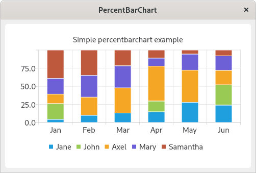
qtcharts_percentbarchart.py の実行例
パーセント棒グラフを作成する場合は、QBarSeries クラスの代わりに QPercentBarSeries クラスのインスタンスをデータ列の定義に使用します。
series = QPercentBarSeries() series.append(set0) series.append(set1) ... ...
参考サイト
- Qt Charts Examples | Qt Charts 6.1.2
- Qt for Python Examples — Qt for Python
- bitWalk's: Qt for Python によるチャート (3) [2021-07-21]
- bitWalk's: Qt for Python によるチャート (10) [2021-07-28]

にほんブログ村
0 件のコメント:
コメントを投稿