
Matplotlib は、Python と NumPy のためのプロットライブラリです。Tkinter、wxPython、Qt、GTK のような汎用 GUI ツールキットを使ったアプリケーションにプロットを埋め込むためのオブジェクト指向 API を提供しています。
Matplotlib によるチャート作成では、なんとなく時系列データの扱いに苦手意識を持っています。それでも最近はデータ解析で時系列データを扱うことが多くなってきているので、毎回調べ直さなくとも済むように、気になるトピックを備忘録として不定期にまとめていきます。
- 時系列データを Matplotlib でトレンドチャートにして表示します。
- さらに、データの加工例として SciPy を利用してスプライン補間した曲線を重ねて表示します。
- y 軸を追加して、スプライン補間した曲線の微分値をプロットします。
下記の OS 環境で動作確認をしています。

|
Fedora Workstation 39 | x86_64 |
| Python | 3.12.2 | |
| pandas | 2.2.0 | |
| matplotlib | 3.8.3 | |
| scipy | 1.12.0 |
サンプルデータ
今回使用するサンプルデータは、参考サイト [1]、気象庁のサイトからダウンロートした、今年 3 月 1 日の気温データ(東京、1時間毎)を使用します。ただし、扱いやすいように少し整形して UTF-8 のエンコードで保存した CSV 形式のファイルです。
下記からダウンロードできます。
| temperature.csv |
ファイルの内容は以下のように「年月日時」と「気温」の二列のデータになっています。
年月日時,気温
2024/3/1 00:00:00,7
2024/3/1 1:00:00,7
2024/3/1 2:00:00,6.7
   :
   :
トレンドチャート
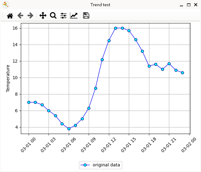
最初は、サンプルデータの CSV ファイルを読み込んで、データ点を時間順に◯で表示、データ間を直線でつないで表示します。
実行例を示しました。
ファイルの読み込み
今回のサンプルデータの最初の列「年月日時」は、重複無く順番に並んでいる情報ですので、これを Pandas データフレームのインデックスとして読み込みます。引数 index_col に列「年月日時」の列 0 を指定し、引数 parse_dates を True とします。すると、列「年月日時」が DatetimeIndex 型のインデックスとして読み込まれます [2]。
import pandas as pd

if __name__ == '__main__':
    csvfile = 'temperature.csv'
    df = pd.read_csv(csvfile, index_col=0, parse_dates=True)
    print(df)
    print(type(df.index))
実行時の出力は以下のようになります。
                       気温
年月日時
2024-03-01 00:00:00   7.0
2024-03-01 01:00:00   7.0
2024-03-01 02:00:00   6.7
   :
   :
   :
2024-03-01 22:00:00  10.9
2024-03-01 23:00:00  10.6
<class 'pandas.core.indexes.datetimes.DatetimeIndex'>
トレンドチャート
データフレームのインデックスが DatetimeIndex 型になっていると、Matplotlib でプロットする場合、x と y を指定せずともデータフレーム df を指定するだけでプロットできます。
import matplotlib.pyplot as plt
import pandas as pd

if __name__ == '__main__':
        :
        :
    fig, ax = plt.subplots()
    fig.canvas.manager.set_window_title('Trend test')

    line1 = plt.plot(
        df,
        linewidth=1,
        color='blue',
        marker='o',
        markersize=6,
        markeredgecolor='darkblue',
        markeredgewidth=1,
        markerfacecolor='cyan',
        label='original data'
    )

    plt.grid()
    plt.xticks(rotation=45)
    plt.ylabel('Temperature')
    fig.legend(loc='outside lower center')

    plt.subplots_adjust(top=0.99, left=0.1, bottom=0.25, right=0.95)
    plt.show()
時間軸の目盛ラベルの「月-日 時」は、ちょっと長いので、隣の目盛ラベルと重ならないように 45 度傾けました。また、プロットの余白を調節しています。
スプライン補間
チャート上のデータ点と次の点を直線で結ぶ、というのは無難な表現なのかもしれません。
しかし、このサンプルの 気温 のように、通常は連続的に値が変化しているのに、サンプリングの都合で離散的なデータになっている場合は、データ点間をなめらかな曲線でつなげて変化を近似したいこともあります。そうすればその曲線を微分することによって、近似的に変化点の評価をすることもできます。
そんな時に便利なのがB-スプライン曲線による補間です。ずいぶん昔から利用しているB-スプライン曲線なのですが、残念ながら、自分はしっかりとした説明ができません、ごめんなさい。🙇🏻
SciPy の interpolate(補間ツール)にある make_interp_spline でB-スプライン曲線を計算して、トレンドチャートに重ねてみます [3]。
まずはサンプルから。前出のサンプルをベースにしています。
実行例を示しました。
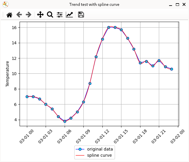
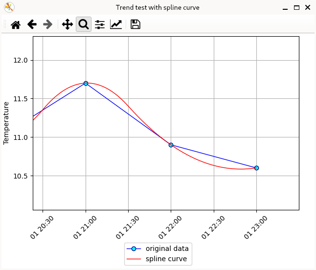
ナビゲーターバーの虫眼鏡アイコンをクリックして ON にするよ、プロット上をマウスでドラッグして指定した矩形領域を拡大できます。これで直線(青)とスプライン曲線(赤)の違いを確認できます。
時刻情報の扱い
時刻情報は、今回はデータフレームのインデックスに DateTimeIndex として読み込んでいますが、 SciPy ではこの時刻情報を数値としては扱えません。
DatetimeIndex(['2024-03-01 00:00:00', '2024-03-01 01:00:00',
               '2024-03-01 02:00:00', '2024-03-01 03:00:00',
               '2024-03-01 04:00:00', '2024-03-01 05:00:00',
               '2024-03-01 06:00:00', '2024-03-01 07:00:00',
               '2024-03-01 08:00:00', '2024-03-01 09:00:00',
               '2024-03-01 10:00:00', '2024-03-01 11:00:00',
               '2024-03-01 12:00:00', '2024-03-01 13:00:00',
               '2024-03-01 14:00:00', '2024-03-01 15:00:00',
               '2024-03-01 16:00:00', '2024-03-01 17:00:00',
               '2024-03-01 18:00:00', '2024-03-01 19:00:00',
               '2024-03-01 20:00:00', '2024-03-01 21:00:00',
               '2024-03-01 22:00:00', '2024-03-01 23:00:00'],
              dtype='datetime64[ns]', name='年月日時', freq=None)
ちょっと手間ですが、SciPy では以下のように時刻情報のインデックス df.index をタイムスタンプのインデックス ts に変換して利用することにします。タイムスタンプへの変換は、参考サイト [4] を参考にさせていただきました。
import pandas as pd
from pandas import DatetimeIndex, Index
        :
        :
        :
    ts: Index = df.index.map(pd.Timestamp.timestamp)
    print(ts)
Index([1709251200.0, 1709254800.0, 1709258400.0, 1709262000.0, 1709265600.0,
       1709269200.0, 1709272800.0, 1709276400.0, 1709280000.0, 1709283600.0,
       1709287200.0, 1709290800.0, 1709294400.0, 1709298000.0, 1709301600.0,
       1709305200.0, 1709308800.0, 1709312400.0, 1709316000.0, 1709319600.0,
       1709323200.0, 1709326800.0, 1709330400.0, 1709334000.0],
      dtype='float64', name='年月日時')
B-スプライン曲線の計算
時刻をタイムスタンプに変換した ts と、対応する気温データ df['気温'] で、補間するB-スプライン曲線(の係数)を計算する BSpline クラスのインスタンス bspl を生成します。次数は k で指定しますが、ここでは 2(二次)としています。
from scipy.interpolate import make_interp_spline, BSpline
        :
        :
        :
    bspl: BSpline = make_interp_spline(ts, df['気温'], k=2)
B-スプライン曲線を計算するために、サンプルと同じ時間内でより細かく刻んだ時刻列を用意します、ここでは(ちょっとやりすぎかもしれませんが)1分刻みで作成しました。
    x1: DatetimeIndex = pd.date_range(min(df.index), max(df.index), freq='1min')
    ts1: Index = x1.map(pd.Timestamp.timestamp)
プロット用には x1、B-スプライン曲線の計算用にはタイムスタンプに変換した ts1 を使います。
ts1 に対応したB-スプライン曲線の気温データ y1 を BSpline のインスタンス bspl で算出します。
y1 = bspl(ts1)
B-スプライン曲線のプロット
プロットには x1 と y1 のペアを使います。
    line2 = plt.plot(
        x1, y1,
        linewidth=1,
        color='red',
        label='spline curve'
    )
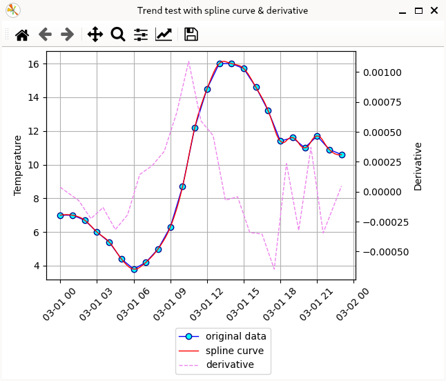
二つの y 軸で表示 [2024-03-26 追加]
右側に二つ目の y 軸を追加して、B-スプライン曲線を微分した値を表示します。
微分値を算出する導関数の追加と軸を二つする都合でいくつか変更を加えたサンプルです。
実行例を示しました。
B-スプライン曲線の導関数
BSpline クラスの derivative(nu) (デフォルトは nu=1)メソッドで導関数のインスタンスを生成できます。
    dbspl = bspl.derivative(nu=1)
    dy1 = dbspl(ts1)
この dy1(一次微分値)を重ねてプロットするために、共通の x 軸に対して、右側にもうひとつの y 軸を追加してプロットすることにします。
二つの y 軸を扱うときの変更点
単純に x-y 軸でプロットする時には plt.plot(...) というように、plt(= pyplot)でプロットできましたが、二軸にすると、どちらに表示するかを軸 (ax) を基準にして指定する必要が出てきます。plt と ax のメソッドには微妙な違いがあるので、それに留意して書き換えます。
まず、ファイルから読み込んだ「年月日時」と「気温」の二列のデータのプロットは以下のようになります。ここは単純に plt を ax へ置き換えただけです。
    line1 = ax.plot(
        df,
        linewidth=1,
        color='blue',
        marker='o',
        markersize=6,
        markeredgecolor='darkblue',
        markeredgewidth=1,
        markerfacecolor='cyan',
        label='original data'
    )
B-スプライン曲線を表示する部分も同様に plt を ax へ置き換えます。
    line2 = ax.plot(
        x1, y1,
        linewidth=1,
        color='red',
        label='spline curve'
    )
次に二つ目の y 軸を追加して、B-スプライン曲線の導関数で算出した微分値 dy1 をプロットします。
y 軸の追加は、ax2 = ax.twinx() で生成した ax2 を使います [5]。
    ax2 = ax.twinx()
    line3 = ax2.plot(
        x1, dy1,
        linewidth=1,
        linestyle='dashed',
        color='violet',
        label='derivative'
    )
x 軸の目盛ラベルに傾けて表示する方法がちょっと面倒になっています。グリッドは ax を基準にしました。また余白の調節をしています。
    fig.legend(loc='outside lower center')

    for tick in ax.get_xticklabels():
        tick.set_rotation(45)
    ax.set_ylabel('Temperature')
    ax.grid()

    ax2.set_ylabel('Derivative')

    plt.subplots_adjust(top=0.99, left=0.1, bottom=0.3, right=0.8)
    plt.show()
参考サイト
- 気象庁|過去の気象データ検索
- pandas.DataFrame, Seriesを時系列データとして処理 | note.nkmk.me
- scipy.interpolate.make_interp_spline — SciPy v1.12.0 Manual
- pandasで日付・時間の列を処理(文字列変換、年月日抽出など) | note.nkmk.me
- matplotlib.axes.Axes.twinx — Matplotlib documentation
にほんブログ村

#オープンソース

0 件のコメント:
コメントを投稿