PySide (Qt for Python) は、Qt(キュート)の Python バインディングで、GUI などを構築するためのクロスプラットフォームなライブラリです。Linux/X11, macOS および Microsoft Windows をサポートしています。配布ライセンスは LGPL で公開されています。
動作確認をするときには JupyterLab 上で Matplotlib でちゃちゃっプロットしていますが、常用する用途は PySide6 で GUI アプリにするのが常です。今回は Matplotlib を使った過去記事を PySide6 の GUI アプリにしてみました。
今回のテーマ
- 当ブログの過去記事 [1] で扱った Matplotlib のチャートを PySide6 の GUI 上で扱えるように移植します。
下記の OS 環境で動作確認をしています。
![]() |
Fedora Workstation 39 | x86_64 |
Python | 3.12.2 | |
PySide6 | 6.6.2 | |
pandas | 2.2.0 | |
matplotlib | 3.8.3 | |
scipy | 1.12.0 |
サンプルデータ
サンプルデータは、過去記事 [1] と同じです。
下記からダウンロードできます。
temperature.csv |
PySide6 の GUI 上の Matplotlib チャート
GUI 部分以外は過去記事のコードとほぼ同じになるように移植してみました。
qt_matplotlib_trend.py
This file contains bidirectional Unicode text that may be interpreted or compiled differently than what appears below. To review, open the file in an editor that reveals hidden Unicode characters.
Learn more about bidirectional Unicode characters
import sys | |
from typing import Union | |
import pandas as pd | |
from PySide6.QtCore import QObject, Qt | |
from PySide6.QtWidgets import ( | |
QApplication, | |
QDockWidget, | |
QMainWindow, | |
QStyle, | |
QWidget, | |
) | |
from matplotlib.backends.backend_qtagg import ( | |
FigureCanvasQTAgg as FigureCanvas, | |
NavigationToolbar2QT as NavigationToolbar, | |
) | |
from matplotlib.figure import Figure | |
from pandas import Index, DatetimeIndex | |
from scipy.interpolate import BSpline, make_interp_spline | |
class MyCanvas(FigureCanvas): | |
def __init__(self): | |
self.fig = Figure() | |
self.ax = self.fig.add_subplot() | |
super().__init__(self.fig) | |
def clearAxes(self): | |
self.ax.cla() | |
def refreshDraw(self): | |
self.fig.canvas.draw() | |
class Example(QMainWindow): | |
def __init__(self): | |
super().__init__() | |
self.setWindowIcon( | |
self.style().standardIcon( | |
QStyle.StandardPixmap.SP_TitleBarMenuButton | |
) | |
) | |
self.setWindowTitle('Trend test') | |
canvas = MyCanvas() | |
self.setCentralWidget(canvas) | |
dock = QDockWidget() | |
dock.setTitleBarWidget(QWidget(None)) | |
dock.setWidget(NavigationToolbar(canvas)) | |
self.addDockWidget(Qt.DockWidgetArea.TopDockWidgetArea, dock) | |
csvfile = 'temperature.csv' | |
df = pd.read_csv(csvfile, index_col=0, parse_dates=True) | |
self.draw_plot(df) | |
def draw_plot(self, df: pd.DataFrame): | |
canvas: Union[QObject, MyCanvas] = self.centralWidget() | |
fig = canvas.fig | |
ax = canvas.ax | |
ax.plot( | |
df, | |
linewidth=1, | |
color='blue', | |
marker='o', | |
markersize=6, | |
markeredgecolor='darkblue', | |
markeredgewidth=1, | |
markerfacecolor='cyan', | |
label='original data' | |
) | |
ts: Index = df.index.map(pd.Timestamp.timestamp) | |
bspl: BSpline = make_interp_spline(ts, df['気温'], k=2) | |
dbspl = bspl.derivative(nu=1) | |
x1: DatetimeIndex = pd.date_range(min(df.index), max(df.index), freq='1min') | |
ts1: Index = x1.map(pd.Timestamp.timestamp) | |
y1 = bspl(ts1) | |
dy1 = dbspl(ts1) | |
ax.plot( | |
x1, y1, | |
linewidth=1, | |
color='red', | |
label='spline curve' | |
) | |
ax2 = ax.twinx() | |
ax2.plot( | |
x1, dy1, | |
linewidth=1, | |
linestyle='dashed', | |
color='violet', | |
label='derivative' | |
) | |
for tick in ax.get_xticklabels(): | |
tick.set_rotation(45) | |
ax.set_ylabel('Temperature') | |
ax.grid() | |
ax2.set_ylabel('Derivative') | |
fig.legend(loc='outside lower center') | |
fig.subplots_adjust(top=0.99, left=0.1, bottom=0.3, right=0.8) | |
def main(): | |
app = QApplication(sys.argv) | |
ex = Example() | |
ex.show() | |
sys.exit(app.exec()) | |
if __name__ == '__main__': | |
main() |
実行結果を以下に示しました。PySide6 の GUI アプリとして識別できるように Qt のアイコンをタイトルバーに表示しましたが、デスクトップ環境によってはこのアイコンが表示されません(例:KDE Plasma)。
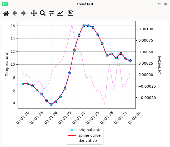
qt_matplotlib_trend.py の実行例
過去記事の Matplotlib の出力とほぼ同じになるように、今回はごくシンプルな GUI サンプルを作りましたが、実用では、メニューバーを付けたり、タブやボタンを付けたりと用途に応じた機能を追加しています。
参考サイト
- bitWalk's: 【備忘録】Matplotlib と時系列データ [2024-03-25]

にほんブログ村
#オープンソース

0 件のコメント:
コメントを投稿