
主成分分析 (Principal Component Analysis, PCA) は、1観測あたり多数の次元/特徴を含む大規模データセットを分析し、最大限の情報量を保持しながらデータの解釈可能性を高め、多次元データの可視化を可能にする手法としてよく利用されています。形式的には、PCA はデータセットの次元を減少させる統計的手法です。これは、データの変動(の大部分)が、初期データよりも少ない次元で記述できるような新しい座標系にデータを線形変換することにより達成できます。
データ解析で頻繁に主成分分析 (PCA) を利用しています。主成分分析をはじめ、よく使用する機械学習の処理部分などは、いつも過去に使ったスクリプトから必要部分をコピペして使い回してしまっているので、思い違いや間違いがあれば、そのままずっと引きずってしまう可能性があります。ちょっと心配になってきたので、簡単なサンプルを使ってスクリプトを整理しようとしています。
可視化いろいろ
今回は Python による主成分分析の結果を可視化することに焦点を当てます。主に、主成分の散布図+α についてまとめています。なお、可視化したプロットについての解釈は一切していません。あらかじめご了承ください。
下記の OS 環境で動作確認をしています。

|
Fedora Linux 37 Workstation | x86_64 |
| Python | 3.10.9 |

今回も JupyterLab の Notebook 上で動作確認をしています。今回の興味は、主成分分析の結果を可視化することですので、まず、主成分分析をまとめて処理してしまいます。本ブログ記事 [1] で紹介した Iris データセットの主成分分析の処理を、必要な部分だけぎゅっとひとつにまとめました。
import pandas as pd
import dataframe_image as dfi
from sklearn.pipeline import Pipeline
from sklearn.preprocessing import StandardScaler
from sklearn.decomposition import PCA

# https://www.kaggle.com/datasets/saurabh00007/iriscsv
filename = 'Iris.csv'
df = pd.read_csv(filename, index_col=0)
cols_x = list(df.columns[0:4])
col_y = df.columns[4]

# model pipeline for PCA
pipe = Pipeline(steps=[
    ('scaler', StandardScaler()),
    ('PCA', PCA()),
])
features = df[cols_x]
pipe.fit(features)

# PCA scores
scores = pipe.transform(features)
df_pca = pd.DataFrame(
    scores,
    columns=["PC{}".format(x + 1) for x in range(scores.shape[1])],
    index=df.index
)
cols_pc = list(df_pca.columns)
df_pca.insert(0, col_y, df[col_y].copy())
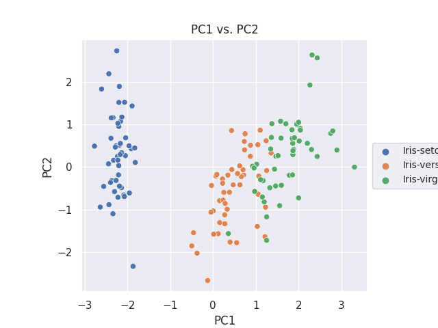
PC1 vs. PC2 に注目
サンプルに使用した Iris のデータセットでは、累積寄与率のプロットから最初の主成分 (PC1) と次の主成分 (PC2) で、データのばらつきの9割以上を説明できていることが判っています。そのため、PC1 と PC2 の関係をどう可視化するかに焦点を当てます。
まずは PC1 と PC2 の散布図を作成します。
import matplotlib.pyplot as plt
import seaborn as sns
plt.rcParams['font.size'] = 14

fig, ax = plt.subplots()
sns.scatterplot(data=df_pca, x='PC1', y='PC2', hue=col_y, ax=ax)
ax.set_aspect('equal')
ax.legend(loc='center left', bbox_to_anchor=(1, 0.5), fontsize=10)
ax.set_title('PC1 vs. PC2')

plt.savefig('iris_021_PCA_PC1PC2.png')
plt.show()
KDE plot
Seaborn の kdeplot [2] で、KDE(Kernel Density Estimation, カーネル密度推定)を二次元で視覚化します。
まずはターゲット (Species) 別に色分けしてみます。
fig, ax = plt.subplots()
sns.kdeplot(data=df_pca, x='PC1', y='PC2', hue=col_y, fill=True, alpha=0.3, ax=ax)
sns.kdeplot(data=df_pca, x='PC1', y='PC2', hue=col_y, alpha=0.3, ax=ax)
sns.scatterplot(data=df_pca, x='PC1', y='PC2', hue=col_y, ax=ax)
ax.set_aspect('equal')
ax.legend(loc='center left', bbox_to_anchor=(1, 0.5), fontsize=10)
ax.set_title('PC1 vs. PC2')

plt.savefig('iris_022_PCA_PC1PC2.png')
plt.show()
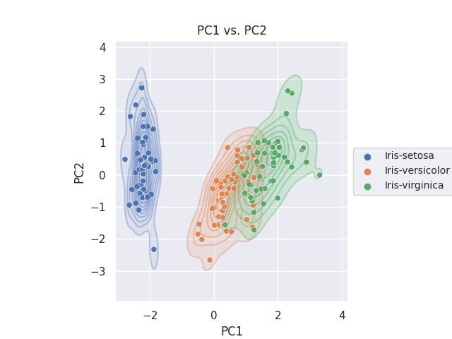
等高線も塗りつぶしも両方表現したかったので、重ね書きをしています。
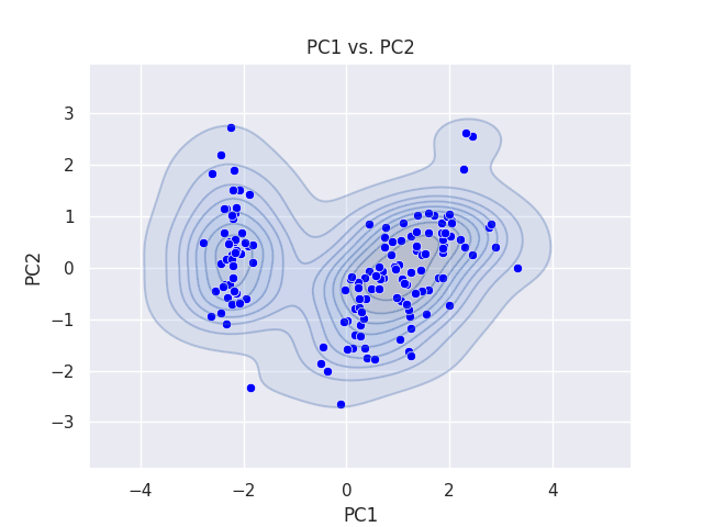
次は、ターゲット別にせずに全体に対してプロットしています。
fig, ax = plt.subplots()
sns.kdeplot(data=df_pca, x='PC1', y='PC2', fill=True, alpha=0.3, ax=ax)
sns.kdeplot(data=df_pca, x='PC1', y='PC2', alpha=0.3, ax=ax)
sns.scatterplot(data=df_pca, x='PC1', y='PC2', color='blue', ax=ax)
ax.set_aspect('equal')
ax.set_title('PC1 vs. PC2')

plt.savefig('iris_023_PCA_PC1PC2.png')
plt.show()
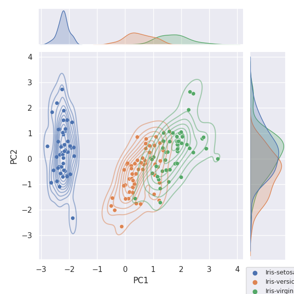
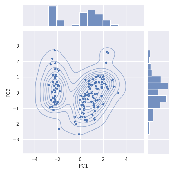
Joint plot
Seaborn の jointplot [3] を利用すると、簡単に散布図と KDE プロットを描画できるばかりか、軸方向の分布(ヒストグラム)も確認できます。
まずはターゲット (Species) 別に色分けしてみます。
g = sns.jointplot(data=df_pca, x='PC1', y='PC2', hue=col_y)
g.plot_joint(sns.kdeplot, alpha=0.5)

plt.legend(bbox_to_anchor=(1, -0.02), loc='upper left', fontsize=9)
plt.savefig('iris_024_PCA_PC1PC2.png')
plt.show()
次は、ターゲット別にせずに全体に対してプロットしています。
g = sns.jointplot(data=df_pca, x='PC1', y='PC2')
g.plot_joint(sns.kdeplot, alpha=0.5)

plt.savefig('iris_025_PCA_PC1PC2.png')
plt.show()
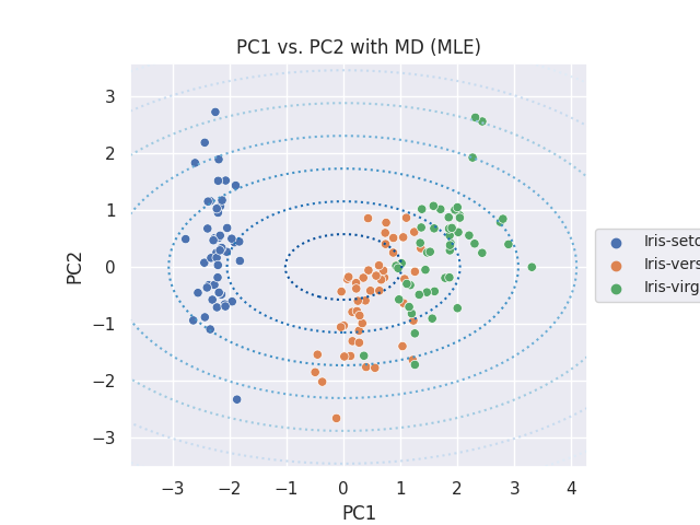
Mahalanobis Distance
Mahalanobis Distance(マハラノビス距離、MD と表します)を等高線で表示します。マハラノビス距離の計算については、参考サイト [4] を参考にしています。通常の MLE、外れ値にロバストな MCD の二種類の方法で算出した MD をプロットします。
まず、モデルを作成します。ここでは簡単に、PC1 と PC2 のデータセットでの共分散行列を算出します。
# https://scikit-learn.org/stable/auto_examples/covariance/plot_mahalanobis_distances.html
from sklearn.covariance import EmpiricalCovariance, MinCovDet
X = df_pca[['PC1', 'PC2']]
emp_cov = EmpiricalCovariance().fit(X)
robust_cov = MinCovDet().fit(X)
関数をひとつ用意しておきます。
def adjust_range(list_range, mag):
    xdelta =(list_range[1] - list_range[0]) * factor
    return list_range[0] - xdelta, list_range[1] + xdelta
共分散の最尤推定量 (MLE) で計算した MD
import numpy as np

fig, ax = plt.subplots()
sns.scatterplot(data=df_pca, x='PC1', y='PC2', hue=col_y, ax=ax)
ax.set_aspect('equal')
ax.legend(loc='center left', bbox_to_anchor=(1, 0.5), fontsize=10)
ax.set_title('PC1 vs. PC2 with MD (MLE)')

# adjust axis range wider
factor = 0.1
plt.xlim(adjust_range(plt.xlim(), factor))
plt.ylim(adjust_range(plt.ylim(), factor))

# Create meshgrid of feature 1 and feature 2 values
xx, yy = np.meshgrid(
    np.linspace(plt.xlim()[0], plt.xlim()[1], 100),
    np.linspace(plt.ylim()[0], plt.ylim()[1], 100),
)
zz = np.c_[xx.ravel(), yy.ravel()]

# Calculate the MLE based Mahalanobis distances of the meshgrid
mahal_emp_cov = emp_cov.mahalanobis(zz)
mahal_emp_cov = mahal_emp_cov.reshape(xx.shape)
emp_cov_contour = plt.contour(
    xx, yy, np.sqrt(mahal_emp_cov), cmap=plt.cm.Blues_r, linestyles="dotted"
)
ax.annotate('The covariance maximum likelihood estimate (MLE)', xy = (0, -0.2), xycoords='axes fraction', fontsize=10)

plt.savefig('iris_026_PCA_PC1PC2.png')
plt.show()
最小共分散行列式の推定量 (MCD) で計算した MD
fig, ax = plt.subplots()
sns.scatterplot(data=df_pca, x='PC1', y='PC2', hue=col_y, ax=ax)
ax.set_aspect('equal')
ax.legend(loc='center left', bbox_to_anchor=(1, 0.5), fontsize=10)
ax.set_title('PC1 vs. PC2 with MD (MCD)')

# adjust axis range wider
factor = 0.1
plt.xlim(adjust_range(plt.xlim(), factor))
plt.ylim(adjust_range(plt.ylim(), factor))

# Create meshgrid of feature 1 and feature 2 values
xx, yy = np.meshgrid(
    np.linspace(plt.xlim()[0], plt.xlim()[1], 100),
    np.linspace(plt.ylim()[0], plt.ylim()[1], 100),
)
zz = np.c_[xx.ravel(), yy.ravel()]

# Calculate the MCD based Mahalanobis distances
mahal_robust_cov = robust_cov.mahalanobis(zz)
mahal_robust_cov = mahal_robust_cov.reshape(xx.shape)
robust_contour = ax.contour(
    xx, yy, np.sqrt(mahal_robust_cov), cmap=plt.cm.Reds_r, linestyles="dotted"
)
ax.annotate('The Minimum Covariance Determinant estimator (MCD)', xy = (0, -0.2), xycoords='axes fraction', fontsize=10)

plt.savefig('iris_027_PCA_PC1PC2.png')
plt.show()
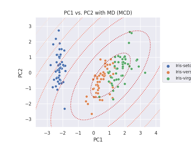
上記二種類のプロットにはアノテーション (ax.annotate) を入れておいたのですが、保存した画像には含まれませんでした。
参考サイト
- bitWalk's: 【備忘録】主成分分析 ~ Python / Scikit-Learn ~ [2022-12-27]
- seaborn.kdeplot — seaborn 0.12.2 documentation
- seaborn.jointplot — seaborn 0.12.2 documentation
- Robust covariance estimation and Mahalanobis distances relevance — scikit-learn 1.2.0 documentation
にほんブログ村

#オープンソース

0 件のコメント:
コメントを投稿