TA-Lib, Technical Analysis Library は 2001 年にリリースされ、20 年以上経った今でも広く利用されている著名なアルゴリズムを提供しています。コードは安定しており、長年にわたる検証を経ています。200 以上のテクニカル指標をサポートしており、API は C/C++ で記述されており Python ラッパー (wrapper) も提供されています。TA-Lib は BSD License (BSD-2-Clause license) の元で配布されているオープンソースのライブラリです。
以前は Linux 上で TA-Lib の Python 用パッケージを pip でインストールしてもビルドが必要で、しかもエラーでビルドできませんでした。自力でエラーを解決できなかったので TA-Lib の利用を避けていました。しかし最近の TA-Lib のバージョンの Python 用パッケージでは難なくインストールできることが判りました。
そこで今更ですが TA-Lib の使い方をおぼえようと、Jupyter Lab 上でテクニカル指標のいくつかをプロットしてみたので、備忘録的に内容をまとめました。
下記の OS 環境で動作確認をしています。

|
Fedora Linux Workstation |
42 x86_64 |
| Python |
3.13.7 |
| JupyterLab |
4.4.7 |
| matplotlib |
3.10.6 |
| mplfinance |
0.12.10b0 |
| numpy |
2.3.3 |
| pandas |
2.3.2 |
| ta-lib |
0.6.7 |
| yfinance |
0.2.65 |
サンプル
ライブラリをインポート
最初に利用するライブラリをまとめてインポートします。
import matplotlib.font_manager as fm
import matplotlib.pyplot as plt
import mplfinance as mpf
import numpy as np
import pandas as pd
import yfinance as yf
from talib import BBANDS, MACD, MFI, MOM, OBV, RSI, SAR, STOCH
yfinance で日経平均株価指数の過去データを取得
サンプルとして、今年の 1 月から半年間の日足データを取得します。
symbol = "^N225"
ticker = yf.Ticker(symbol)
df = ticker.history(start="2025-01-01", end="2025-07-01", interval="1d")
サンプル期間より少し古いデータからも取得しておきます。これでテクニカル指標を算出して、サンプルの期間の最初から指標がプロットされるようにします。
df2 = ticker.history(start="2024-10-01", end="2025-07-01", interval="1d")
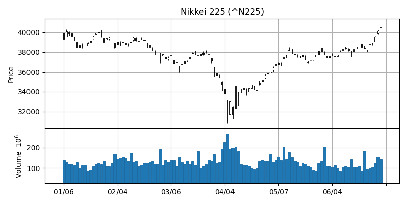
mplfinance でチャートを作成
サンプル期間の日足データをローソク足チャートと出来高の棒グラフを並べてプロットしました。
fig = plt.figure(figsize=(8, 4))
ax = dict()
n = 2
gs = fig.add_gridspec(
    n, 1, wspace=0.0, hspace=0.0, height_ratios=[3 if i == 0 else 1 for i in range(n)]
)
for i, axis in enumerate(gs.subplots(sharex="col")):
    ax[i] = axis
    ax[i].grid()

mpf.plot(
    df,
    type="candle",
    style="default",
    datetime_format="%m/%d",
    xrotation=0,
    ax=ax[0],
    volume=ax[1],
)
ax[0].set_title(f"{ticker.info['longName']} ({symbol})")

plt.tight_layout()
# plt.savefig("screenshots/n225_default.png")
plt.show()
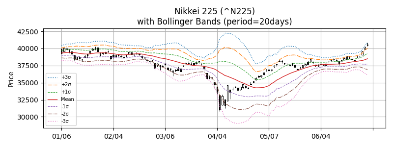
Bollinger bands
過去 20 日間の移動平均、移動標準偏差 +3σ, +2σ, +1σ, mean, -1σ, -2σ, -3σ でボリンジャーバンドを作成しました。
fig, ax = plt.subplots(figsize=(8, 3))

# BBANDS - Bollinger Bands
# upperband, middleband, lowerband = BBANDS(real, timeperiod=5, nbdevup=2, nbdevdn=2, matype=0)
period = 20
mv_upper_1, mv_mean, mv_lower_1 = BBANDS(df2["Close"], period, 1, 1)
mv_upper_2, _, mv_lower_2 = BBANDS(df2["Close"], period, 2, 2)
mv_upper_3, _, mv_lower_3 = BBANDS(df2["Close"], period, 3, 3)

apds = [
    mpf.make_addplot(
        mv_upper_3[df.index],
        width=1,
        color="C0",
        linestyle="dotted",
        label="+3σ",
        ax=ax,
    ),
    mpf.make_addplot(
        mv_upper_2[df.index],
        width=0.9,
        color="C1",
        linestyle="dashdot",
        label="+2σ",
        ax=ax,
    ),
    mpf.make_addplot(
        mv_upper_1[df.index],
        width=0.75,
        color="C2",
        linestyle="dashed",
        label="+1σ",
        ax=ax,
    ),
    mpf.make_addplot(
        mv_mean[df.index],
        width=1,
        color="C3",
        linestyle="solid",
        label="Mean",
        ax=ax,
    ),
    mpf.make_addplot(
        mv_lower_1[df.index],
        width=0.75,
        color="C4",
        linestyle="dashed",
        label="-1σ",
        ax=ax,
    ),
    mpf.make_addplot(
        mv_lower_2[df.index],
        width=0.9,
        color="C5",
        linestyle="dashdot",
        label="-2σ",
        ax=ax,
    ),
    mpf.make_addplot(
        mv_lower_3[df.index],
        width=1,
        color="C6",
        linestyle="dotted",
        label="-3σ",
        ax=ax,
    ),
]
mpf.plot(
    df,
    type="candle",
    style="default",
    addplot=apds,
    datetime_format="%m/%d",
    xrotation=0,
    update_width_config=dict(candle_linewidth=0.75),
    ax=ax,
)
ax.grid()
ax.legend(fontsize=7)
ax.set_title(
    f"{ticker.info['longName']} ({symbol})\nwith Bollinger Bands (period={period}days)"
)

plt.tight_layout()
# plt.savefig("screenshots/n225_talib_bbands.png")
plt.show()
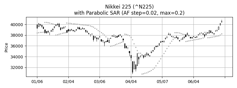
Parabolic SAR
AF step=0.02, max=0.2 で Parabolic SAR をプロットしました。上昇下降トレンドの情報が無いので、灰色の丸点でプロットしました。
fig, ax = plt.subplots(figsize=(8, 3))

# SAR - Parabolic SAR
# real = SAR(high, low, acceleration=0, maximum=0)
af_step = 0.02
af_max = 0.2
sar = SAR(df2["High"], df2["Low"], af_step, af_max)

apds = [
    mpf.make_addplot(
        sar[df.index],
        type="scatter",
        marker='o',
        markersize=3,
        color="darkgray",
        ax=ax,
    ),
]
mpf.plot(
    df,
    type="candle",
    style="default",
    addplot=apds,
    datetime_format="%m/%d",
    xrotation=0,
    update_width_config=dict(candle_linewidth=0.75),
    ax=ax,
)
ax.grid()
ax.set_title(
    f"{ticker.info['longName']} ({symbol})\nwith Parabolic SAR (AF step={af_step}, max={af_max})"
)

plt.tight_layout()
# plt.savefig("screenshots/n225_talib_sar.png")
plt.show()
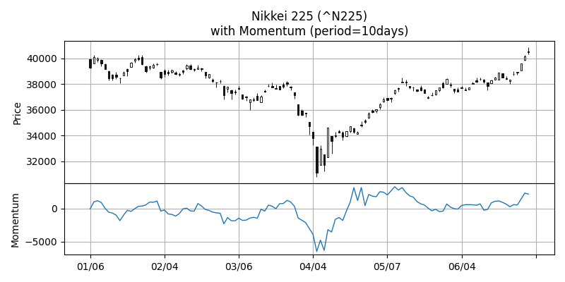
Momentum
過去 10 日間のデータでモメンタムを算出しました。
fig = plt.figure(figsize=(8, 4))
ax = dict()
n = 2
gs = fig.add_gridspec(
    n, 1, wspace=0.0, hspace=0.0, height_ratios=[2 if i == 0 else 1 for i in range(n)]
)
for i, axis in enumerate(gs.subplots(sharex="col")):
    ax[i] = axis
    ax[i].grid()

# MOM - Momentum
# real = MOM(real, timeperiod=10)
period = 10
mom = MOM(df2["Close"], period)
apds = [
    mpf.make_addplot(
        mom[df.index],
        width=1,
        color="C0",
        linestyle="solid",
        ax=ax[1],
    ),
]
mpf.plot(
    df,
    type="candle",
    style="default",
    addplot=apds,
    datetime_format="%m/%d",
    xrotation=0,
    ax=ax[0],
)
ax[1].set_ylabel("Momentum")
ax[0].set_title(
    f"{ticker.info['longName']} ({symbol})\nwith Momentum (period={period}days)"
)

plt.tight_layout()
# plt.savefig("screenshots/n225_talib_mom.png")
plt.show()
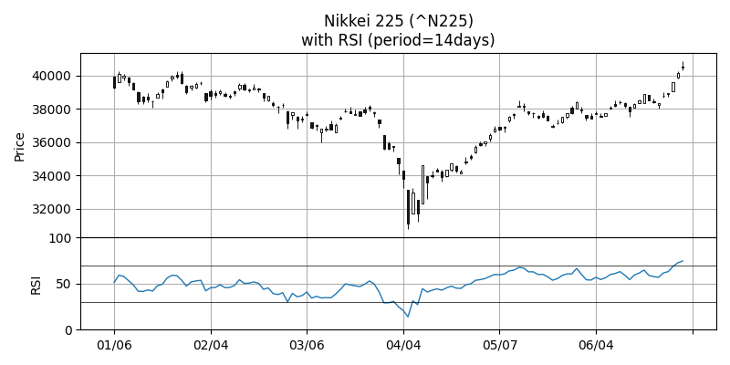
RSI, Relative Strength Index
過去 14 日間のデータで RSI を算出しました。
fig = plt.figure(figsize=(8, 4))
ax = dict()
n = 2
gs = fig.add_gridspec(
    n, 1, wspace=0.0, hspace=0.0, height_ratios=[2 if i == 0 else 1 for i in range(n)]
)
for i, axis in enumerate(gs.subplots(sharex="col")):
    ax[i] = axis
    ax[i].grid()

# RSI - Relative Strength Index
# real = RSI(real, timeperiod=14)
period = 14
rsi = RSI(df2["Close"], period)
apds = [
    mpf.make_addplot(
        rsi[df.index],
        width=1,
        color="C0",
        linestyle="solid",
        ax=ax[1],
    ),
]
mpf.plot(
    df,
    type="candle",
    style="default",
    addplot=apds,
    datetime_format="%m/%d",
    xrotation=0,
    ax=ax[0],
)
ax[0].set_title(f"{ticker.info['longName']} ({symbol})\nwith RSI (period={period}days)")
ax[1].set_ylabel("RSI")
ax[1].set_ylim(0, 100)
ax[1].axhline(30, color="black", linewidth=0.5)
ax[1].axhline(70, color="black", linewidth=0.5)

plt.tight_layout()
# plt.savefig("screenshots/n225_talib_rsi.png")
plt.show()
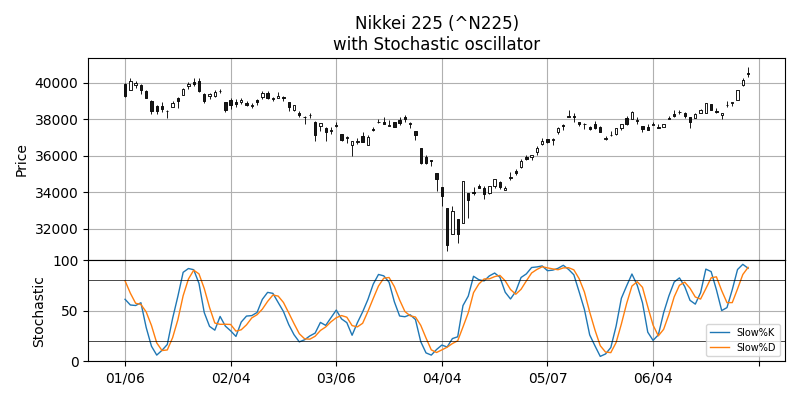
Stochastic oscillator
スローストキャスティクスをデフォルトのパラメータのままでプロットしています。
fig = plt.figure(figsize=(8, 4))
ax = dict()
n = 2
gs = fig.add_gridspec(
    n, 1, wspace=0.0, hspace=0.0, height_ratios=[2 if i == 0 else 1 for i in range(n)]
)
for i, axis in enumerate(gs.subplots(sharex="col")):
    ax[i] = axis
    ax[i].grid()

# STOCH - Stochastic
# slowk, slowd = STOCH(high, low, close, fastk_period=5, slowk_period=3, slowk_matype=0, slowd_period=3, slowd_matype=0)
slowk, slowd = STOCH(df2["High"], df2["Low"], df2["Close"])

apds = [
    mpf.make_addplot(
        slowk[df.index],
        width=1,
        color="C0",
        linestyle="solid",
        label="Slow%K",
        ax=ax[1],
    ),
    mpf.make_addplot(
        slowd[df.index],
        width=1,
        color="C1",
        linestyle="solid",
        label="Slow%D",
        ax=ax[1],
    ),
]
mpf.plot(
    df,
    type="candle",
    style="default",
    addplot=apds,
    datetime_format="%m/%d",
    xrotation=0,
    ax=ax[0],
)
ax[0].set_title(f"{ticker.info['longName']} ({symbol})\nwith Stochastic oscillator")
ax[1].set_ylabel("Stochastic")
ax[1].set_ylim(0, 100)
ax[1].axhline(20, color="black", linewidth=0.5)
ax[1].axhline(80, color="black", linewidth=0.5)
ax[1].legend(fontsize=7)

plt.tight_layout()
# plt.savefig("screenshots/n225_talib_stoch.png")
plt.show()
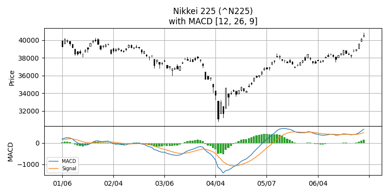
MACD, Moving Average Convergence Divergence
MACD もデフォルトのパラメータでプロットしています。MACD のヒストグラムは正負で色を変えたかったのですが、すぐに出来なかったので単色にしてしまいました。
fig = plt.figure(figsize=(8, 4))
ax = dict()
n = 2
gs = fig.add_gridspec(
    n, 1, wspace=0.0, hspace=0.0, height_ratios=[2 if i == 0 else 1 for i in range(n)]
)
for i, axis in enumerate(gs.subplots(sharex="col")):
    ax[i] = axis
    ax[i].grid()

# MACD - Moving Average Convergence/Divergence
# macd, macdsignal, macdhist = MACD(real, fastperiod=12, slowperiod=26, signalperiod=9)
period_fast = 12
period_slow = 26
period_signal = 9
macd, signal, macdhist = MACD(df2["Close"], period_fast, period_slow, period_signal)

apds = [
    mpf.make_addplot(
        macd[df.index],
        width=1,
        color="C0",
        linestyle="solid",
        label="MACD",
        ax=ax[1],
    ),
    mpf.make_addplot(
        signal[df.index],
        width=1,
        color="C1",
        linestyle="solid",
        label="Signal",
        ax=ax[1],
    ),
    mpf.make_addplot(
        macdhist[df.index],
        type="bar",
        color="C2",
        ax=ax[1],
    ),
]
mpf.plot(
    df,
    type="candle",
    style="default",
    addplot=apds,
    datetime_format="%m/%d",
    xrotation=0,
    ax=ax[0],
)
ax[0].set_title(
    f"{ticker.info['longName']} ({symbol})\nwith MACD [{period_fast}, {period_slow}, {period_signal}]"
)
ax[1].set_ylabel("MACD")
ax[1].legend(fontsize=7)

plt.tight_layout()
# plt.savefig("screenshots/n225_talib_macd.png")
plt.show()
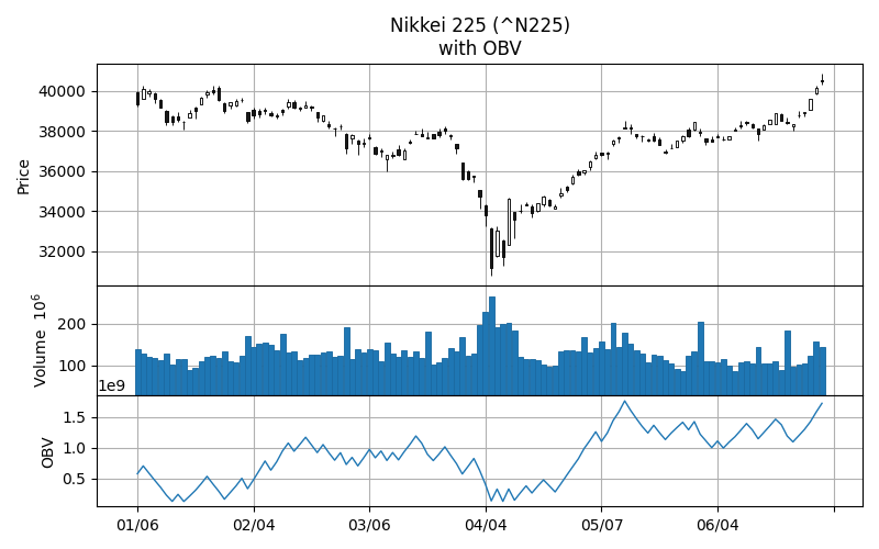
OBV, On Balance Volume
OBV は終値と出来高から算出する指標です。
fig = plt.figure(figsize=(8, 5))
ax = dict()
n = 3
gs = fig.add_gridspec(
    n, 1, wspace=0.0, hspace=0.0, height_ratios=[2 if i == 0 else 1 for i in range(n)]
)
for i, axis in enumerate(gs.subplots(sharex="col")):
    ax[i] = axis
    ax[i].grid()

# OBV - On Balance Volume
# real = OBV(close, volume)
obv = OBV(df2["Close"], df2["Volume"])

apds = [
    mpf.make_addplot(
        obv[df.index],
        width=1,
        color="C0",
        linestyle="solid",
        ax=ax[2],
    ),
]
mpf.plot(
    df,
    type="candle",
    style="default",
    addplot=apds,
    datetime_format="%m/%d",
    xrotation=0,
    ax=ax[0],
    volume=ax[1],
)
ax[0].set_title(f"{ticker.info['longName']} ({symbol})\nwith OBV")
ax[2].set_ylabel("OBV")

plt.tight_layout()
# plt.savefig("screenshots/n225_talib_obv.png")
plt.show()
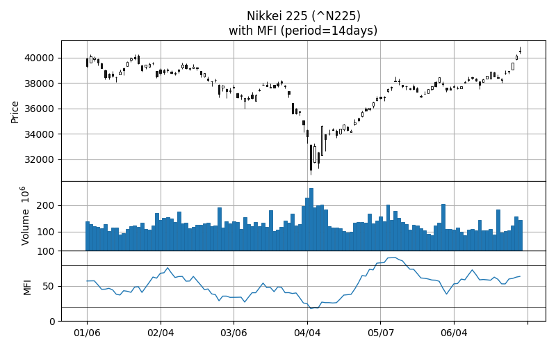
MFI, Money Flow Index
MFI も、株価と出来高から算出する指標です。
fig = plt.figure(figsize=(8, 5))
ax = dict()
n = 3
gs = fig.add_gridspec(
    n, 1, wspace=0.0, hspace=0.0, height_ratios=[2 if i == 0 else 1 for i in range(n)]
)
for i, axis in enumerate(gs.subplots(sharex="col")):
    ax[i] = axis
    ax[i].grid()

# MFI - Money Flow Index
# NOTE: The MFI function has an unstable period.
# real = MFI(high, low, close, volume, timeperiod=14)
period = 14
mfi = MFI(df2["High"], df2["Low"], df2["Close"], df2["Volume"], period)

apds = [
    mpf.make_addplot(
        mfi[df.index],
        width=1,
        color="C0",
        linestyle="solid",
        ax=ax[2],
    ),
]
mpf.plot(
    df,
    type="candle",
    style="default",
    addplot=apds,
    datetime_format="%m/%d",
    xrotation=0,
    ax=ax[0],
    volume=ax[1],
)
ax[0].set_title(f"{ticker.info['longName']} ({symbol})\nwith MFI (period={period}days)")
ax[2].axhline(20, color="black", linewidth=0.5)
ax[2].axhline(80, color="black", linewidth=0.5)
ax[2].set_ylabel("MFI")
ax[2].set_ylim(0, 100)

plt.tight_layout()
# plt.savefig("screenshots/n225_talib_mfi.png")
plt.show()
参考サイト
- TA-Lib - Technical Analysis Library
- TA-Lib/ta-lib: TA-Lib (Core C Library)
- TA-Lib/ta-lib-python: Python wrapper for TA-Lib
- TA-Lib · PyPI


 にほんブログ村
 #オープンソース