PySide (Qt for Python) は、Qt(キュート)の Python バインディングで、GUI などを構築するためのクロスプラットフォームなライブラリです。Linux/X11, macOS および Microsoft Windows をサポートしています。配布ライセンスは LGPL で公開されています。
本ブログ記事 [1] で紹介した Matplotlib のチャートに逐次、データを追加するサンプルを、PySide6 の GUI に移したので、備忘録としてブログ記事にしました。
下記の OS 環境で動作確認をしています。
![]() |
RHEL 9.4 | x86_64 |
Python | 3.12.1 | |
matplotlib | 3.9.0 |
サンプルを以下に示しました。
qt_matplotlib_trend_realtime.py
This file contains bidirectional Unicode text that may be interpreted or compiled differently than what appears below. To review, open the file in an editor that reveals hidden Unicode characters.
Learn more about bidirectional Unicode characters
import math | |
import numpy as np | |
import sys | |
from PySide6.QtCore import QTimer, Qt | |
from PySide6.QtWidgets import QApplication, QMainWindow | |
from matplotlib.backends.backend_qtagg import ( | |
FigureCanvasQTAgg as FigureCanvas, | |
NavigationToolbar2QT as NavigationToolbar, | |
) | |
from matplotlib.figure import Figure | |
class MyTrend(FigureCanvas): | |
def __init__(self, count_max: int, legend_label: str): | |
self.fig = Figure() | |
super().__init__(self.fig) | |
self.ax = ax = self.fig.add_subplot(111) | |
self.ax.set(title='Sample') | |
self.ax.set_xlabel('X') | |
self.ax.set_ylabel('Y') | |
self.ax.set_xlim(0, count_max) | |
self.ax.set_ylim(-1, 1) | |
self.ax.grid(True) | |
self.line, = self.ax.plot([], [], label=legend_label) | |
self.ax.legend(loc='best') | |
def add_data(self, x: float, y: float): | |
x_array = np.append(self.line.get_xdata(), [x]) | |
y_array = np.append(self.line.get_ydata(), [y]) | |
self.line.set_xdata(x_array) | |
self.line.set_ydata(y_array) | |
self.fig.canvas.draw_idle() | |
self.fig.canvas.flush_events() | |
class Example(QMainWindow): | |
def __init__(self): | |
super().__init__() | |
self.setWindowTitle('Trend Sample') | |
self.resize(600, 400) | |
self.count = 0 | |
self.count_max = 500 | |
self.chart = chart = MyTrend( | |
count_max=self.count_max, | |
legend_label='TEST' | |
) | |
self.setCentralWidget(chart) | |
toolbar = NavigationToolbar(chart, self) | |
self.addToolBar( | |
Qt.ToolBarArea.BottomToolBarArea, | |
toolbar | |
) | |
self.timer = timer = QTimer(self) | |
timer.timeout.connect(self.update_data) | |
timer.start(10) | |
def update_data(self): | |
if self.count > self.count_max: | |
self.timer.stop() | |
print('Completed!') | |
return | |
x = float(self.count) | |
y = math.sin(x * 0.1) | |
self.chart.add_data(x, y) | |
self.count += 1 | |
def main(): | |
app = QApplication(sys.argv) | |
ex = Example() | |
ex.show() | |
sys.exit(app.exec()) | |
if __name__ == '__main__': | |
main() |
サンプルの実行例を下記に示しました。
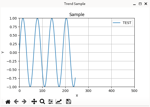
qt_matplotlib_trend_realtime.py の実行例
最近、リアルタイムでデータを取得、統計処理をして可視化することに取り組んでいます。一歩前進できた気分です。
参考サイト
- bitWalk's: 動的に Matplotlib のチャートを利用する [2024-07-04]

にほんブログ村
#オープンソース

0 件のコメント:
コメントを投稿