PySide (Qt for Python) は、Qt(キュート)の Python バインディングで、GUI などを構築するためのクロスプラットフォームなライブラリです。配布ライセンスは LGPL で公開されています(商用ライセンスも有り)。最新のバージョンは Qt6 に対応した PySide6(記事執筆時点で 6.4.2)です。
QChart を使うと、PySide6 だけで色々チャートを作成することができるのですが、普段はチャートの作成に Matplotlib 系のライブラリを使うことが多いので、QChart の使い方を忘れてしまいます。複数のデータ群を QChart を利用して散布図にプロットしようとしたのですが、思うようにできずに苦戦してしまったので、この機会に整理しました。
下記の OS 環境で動作確認をしました。
![]() |
Fedora Linux 37 | (Server Edition) | x86_64 |
python3.11 | python3-3.11.2-1.fc37.x86_64 | ||
PySide6 | 6.4.2 |
ここで紹介するサンプルは、乱数を使って単純にデータ点をプロットするだけのものです。時間軸にしたいときもあるので、敢えて QValueAxis クラスを使ってサンプルを作成しています。
qtcharts_scatterchart_1.py
This file contains bidirectional Unicode text that may be interpreted or compiled differently than what appears below. To review, open the file in an editor that reveals hidden Unicode characters.
Learn more about bidirectional Unicode characters
#!/usr/bin/env python | |
# coding: utf-8 | |
import sys | |
import numpy as np | |
import pandas as pd | |
from PySide6.QtCharts import ( | |
QChart, | |
QChartView, | |
QScatterSeries, | |
QValueAxis, | |
) | |
from PySide6.QtCore import Qt | |
from PySide6.QtGui import ( | |
QPainter, | |
QPen, | |
) | |
from PySide6.QtWidgets import ( | |
QApplication, | |
QMainWindow, | |
) | |
class ScatterChart(QChartView): | |
def __init__(self): | |
super().__init__() | |
chart = self.init_ui() | |
self.setChart(chart) | |
self.setRenderHint(QPainter.Antialiasing) | |
def init_ui(self): | |
chart = QChart() | |
chart.setTitle('Scatter Chart') | |
chart.setDropShadowEnabled(False) | |
chart.legend().hide() | |
axis_x = QValueAxis() | |
chart.addAxis(axis_x, Qt.AlignmentFlag.AlignBottom) | |
axis_y = QValueAxis() | |
chart.addAxis(axis_y, Qt.AlignmentFlag.AlignLeft) | |
list_sample = ['A', 'B', 'C', 'D', 'E', 'F', 'G', 'H', 'I', 'J', 'K', 'L'] | |
list_x = list() | |
list_y = list() | |
for sample in list_sample: | |
series = QScatterSeries() | |
series.setName(sample) | |
series.setMarkerShape(QScatterSeries.MarkerShape.MarkerShapeCircle) | |
series.setMarkerSize(5) | |
series.setPen(QPen(Qt.PenStyle.NoPen)) | |
df = pd.DataFrame(np.random.random(size=(100, 2)), columns=['X', 'Y']) | |
for r in range(len(df)): | |
xy_pair = df.iloc[r, :].to_list() | |
series.append(*xy_pair) | |
list_x.append(xy_pair[0]) | |
list_y.append(xy_pair[1]) | |
chart.addSeries(series) | |
series.attachAxis(axis_x) | |
series.attachAxis(axis_y) | |
axis_x.setRange(min(list_x), max(list_x)) | |
axis_y.setRange(min(list_y), max(list_y)) | |
return chart | |
class Example(QMainWindow): | |
def __init__(self): | |
super().__init__() | |
scatter = ScatterChart() | |
self.setCentralWidget(scatter) | |
self.resize(500, 500) | |
self.setWindowTitle('ScatterChart') | |
def main(): | |
app = QApplication(sys.argv) | |
ex = Example() | |
ex.show() | |
sys.exit(app.exec()) | |
if __name__ == '__main__': | |
main() |
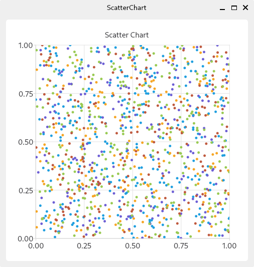
qtcharts_scatterchart_1.py の実行例
参考サイト

にほんブログ村
#オープンソース

0 件のコメント:
コメントを投稿